


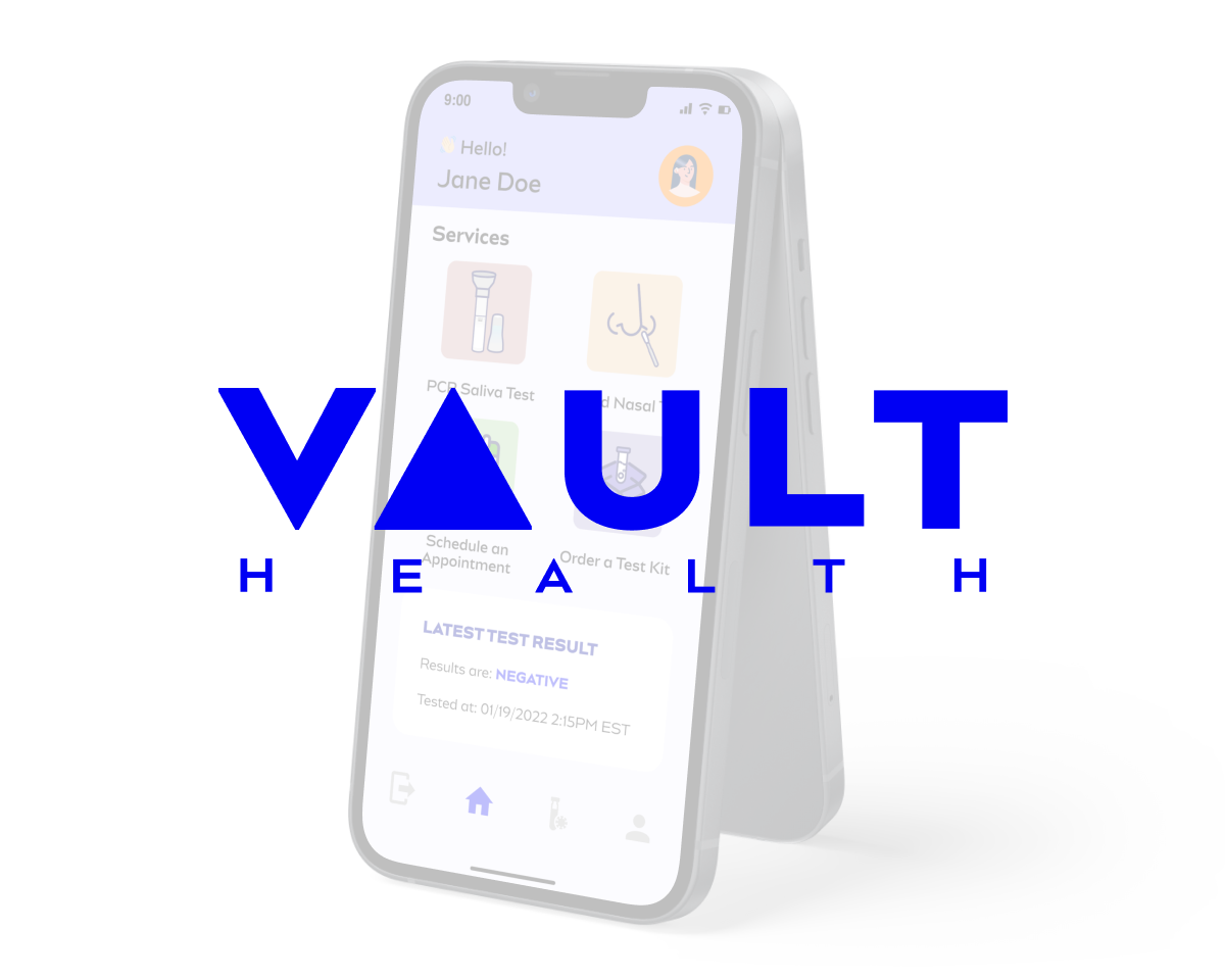
Mobile Application Design
An optimized COVID-19 Testing experience with an all-in-one design.
OVERVIEW
The Client
Vault Health is a telehealth company that accelerates better health outcomes through faster diagnostics, innovative clinical research and digital-first care. Vault Health is a trusted provider to public and private companies, government organizations, and higher education institutions for a variety of diagnostics solutions. This includes: background checks, drug and alcohol checks, and turnkey COVID solutions.
The Problem
Users expressed frustration with wait time and inconvenience with multiple links at Vault Health community testing site.
The Solution
An all-in-one mobile application to optimize user experience while going in for an onsite covid test.
My Roles
UX Researcher, UX Designer
This was a self-identified solo project.
Methodology Used
Directed Storytelling Interviews, Heuristic Analysis, Information Architect, User Flow, Personas, Usability Testing
Tools
Figma, Adobe Illustrator, Google Sheets, Google Slides
Deliverables
THE JOURNEY

Heuristic Analysis
Before diving into the project, I wanted to better understand all the entry points associated with Vault Health’s covid testing services. I conducted a heuristic evaluation of the various links using Jakob Nielsen's 10 usability heuristic. The key violations from my heuristic analysis include:
Match between system and the real world
There were aspects of the web links where the choice of language and words were confusing and did not reflect familiar concepts to the healthcare industry.
Flexibility and efficiency of use
Users need to input links to the various testing service (ie. saliva test or rapid test) each time the user goes in for an onsite test at the community testing site.
Image 1. Users expressed confusion with the term “Orders” used in this instance
Image 2. The series of web links for Vault services
User Interviews
I wanted to gain more insights into other user experiences with the heuristic evaluation in mind. I have used Vault Health Covid-19 testing services and I have had my frustration regarding the system. However, I conducted six directed storytelling interviews to better understand what other pain points users were experiencing.
I collected all my interview data in a spreadsheet. From the spreadsheet, I identified the following commonalities.
Image 3. Conducting a user interview via Zoom
Positive feedback from users:
All users appreciated the free service
allowed for more people to have access to covid testing even if they may not have medical insurance
Users can schedule an appointment or walk-in
The design and flow structure of the testing site was clear and easy to navigate
All users liked that the saliva covid test because not everyone wants a nasal swab
Key pain points expressed by users:
Long wait time when the testing site is busy
Forgetting password
Inconvenience around the multiple links for the different services or tests
Personas
From the research findings, I created the following persona. The persona created is a reflection of the various needs from my user interviews. Creating this persona really helped me stay focus on the problem from a user standpoint.
For this project, I also wanted to create a user journey map. However, I did not get a chance to create the user journey map due to the time constraint and the needing to reschedule a few of my interviews. I had to pivot my process and focused on my designs instead. In a normal research and design process, I would create the journey map to provide stakeholders with an overview of the current user experiences.
Image 4. Persona of Jane Doe

User Flow (Information Architect)
To ensure users can use the app to optimize their covid testing experience. I designed the following user flow map. The features I focused on are highlighted in yellow which are the common pain point that I identified from my user interviews. Additional features like the “Test Results” and “Schedule Appointment” were added based on my findings from the heuristic evaluation.
Image 5. Information Architect Diagram for the Mobile Application
Low-Fidelity Sketch
Based on the research findings, I know that users want a product that could alleviate the inconvenience with multiple web links. Therefore, I started my low-fidelity wireframes focusing on a home page dashboard that would incorporate all the links onto one page. I tested my low-fidelity prototype with one user and did not receive constructive feedback specifically on my wireframe, but the participant provided suggestions around tools to check for accessibility and color contrast.

Image 6. A few frames or the low-fidelity wireframes
Design System
Prior to creating my high-fidelity prototype, I created a frame for the design system to maintain consistency across the mobile application design. Each component of the design system was added as I created the high-fidelity prototype. I also used the existing colors that Vault Health currently uses on the websites since the current users are familiar with them.
Image 7. The design system built to maintain consistency across the mobile application design
Icon Design Iterations
Creating icons for the mobile application was one of the most challenging aspects of this project. I was honestly unsure where to start. During the icon brainstorming process, I considered potential users with limited English skills so I wanted to design icons that would speak to the service and optimize the user experience. Below is the process of the two icons that I spent the most time creating and modifying after feedback from usability testing. I definitely underestimated the amount of work it takes to design an effective icon that could deliver information.
Image 8. Icon iterations

Usability Test
Image 9. Screenshot of a usability test
In order to ensure the mobile application functions as intended and is usable, I conducted four usability tests. The goal of my usability test was to see if the mobile application addresses the pain points around the multiple links, gain insights into whether or not the user thinks the app could reduce the wait time, and if the app helps with users forgetting their passwords. Through each usability test, I made adjustments to the prototype based on the constructive feedback.
Positive findings:
All users found the app functional and usable
All users expressed satisfaction with seeing their latest test results upfront on the home page dashboard
Key findings:
Each user had different personal opinions on the icons on the home page dashboard which was why there were multiple iterations
Some confusion regarding the wording and content of the questionnaire and form
"This looks better because the current website
looks very basic and it doesn’t have images.”
- User 4
Images and icons can assist with information
delivery for users with limited language or reading
skills.
Design Iteration After Usability Tests
Based on user feedback from the usability tests, I made various iterations to my design. It was important to me to consider the user’s constructive feedback and create a design that would be meaningful and understandable while ensuring the final solution reflects my goal of addressing the user's pain points and maintaining a simple design.
Interactive Prototype
The goal of my solo project was to create an interactive mobile application prototype.
Presentation
I also presented my work via Zoom and streamed on Facebook.
CONCLUSION
After conducting user interviews, heuristic analysis and usability testing, the recommendation for the Vault Health mobile application is at a good start. The application is definitely not complete, but I believe with more testing and evaluation, it can definitely serve the users well by optimizing the overall user experience and reducing wait time.
NEXT STEP
There are multiple areas of opportunities. However, for the next steps, I would like to
Conduct more usability tests targeting the content of the forms and questionnaire. I would like to explore ways to simplify the content and reduce redundancy with filling out vaccination questionnaire
Explore push notification and the nuances around notifications and text update
Other areas of opportunities to take into consideration as well:
Efficiently incorporate a simple scheduling appointment form into the mobile application
How to optimize the process of covid testing for a child or minor without the need to create a separate account
Reflection and Key Takeaway
Through conducting this solo project with minimal guidance, one of the lessons that was reinforced from my previous learning was how important it is to listen to what users want before beginning to identify a solution. I learned that users wanted many things and there were times where I had to personally decide what feature would be most important to work on while balancing the functionality, simplicity, and usability of the mobile application. The biggest pain point identified from the user interviews was the wait time, so I focused on the general features to help alleviate some frustrations around this issue instead of refining the content and creating other feature request (ie. a process to add a child to the account instead of creating a brand new account).